
design network
Client/Gallery
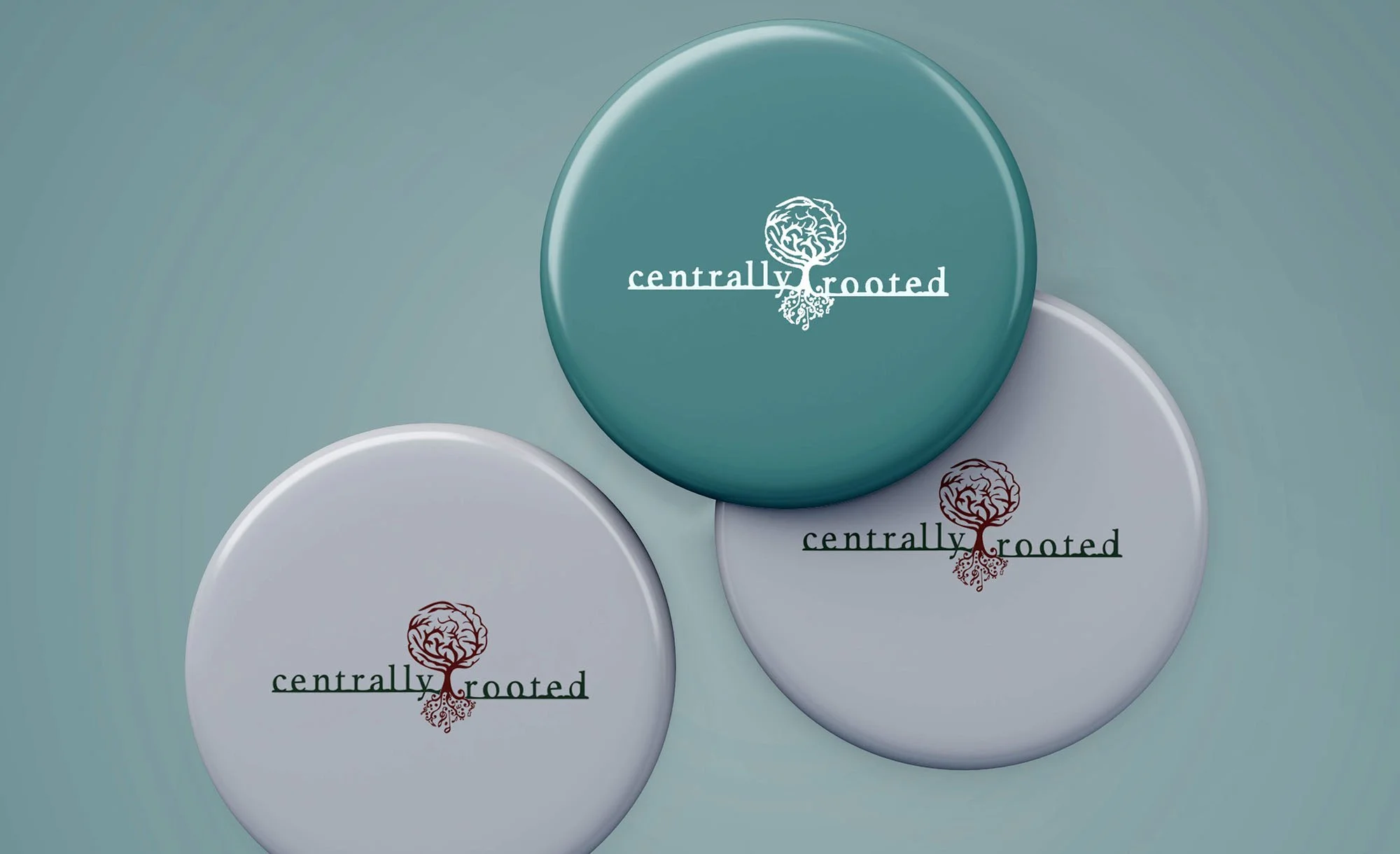
Centrally/Rooted
identity system | Dubuque,IA.
Centrally Rooted is committed to strengthening community bonds, advancing sustainable living, and supporting personal growth. They develop products, services, and initiatives that cultivate a sense of belonging and environmental stewardship, empowering individuals and communities to thrive in harmony.
Primary logo for versatile branding
Secondary logo variations for different applications
Color palette and typography guidelines
Brand usage and placement rules
Complementary graphic elements or icons
Final logo files in multiple formats

Mindful/Musician
identity system | Dubuque,IA.
Mindful musicians foster present-moment awareness during practice, connecting deeply with their core expression. Through sustained attention, they strengthen their emotional connection, audience engagement, and musical integrity, resulting in authentic, resonant performances. This centered approach transcends technical skill, nurturing holistic artistry and creating meaningful musical experiences.
Primary logo for versatile branding
Secondary logo variations for different applications
Color palette and typography guidelines
Brand usage and placement rules
Complementary graphic elements or icons
Final logo files in multiple formats
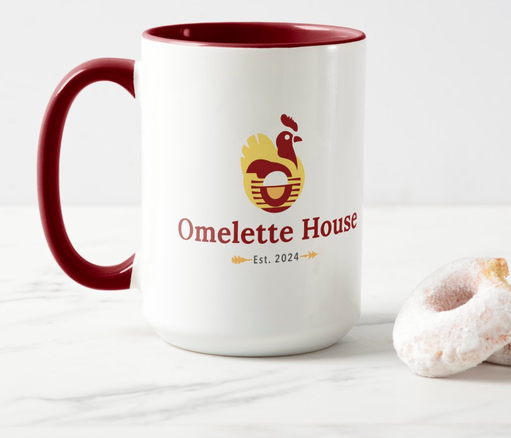
Omellete/House
logo systems | valdosta, GA.
Omelette House in Valdosta is a beloved breakfast destination renowned for its savory omelettes and inviting atmosphere. I created a logo featuring a clean, simplified omelette silhouette combined with rounded typography and warm color tones to evoke a sense of comfort and friendliness. This memorable design seamlessly adapts to signage, menus, and digital media, reinforcing the restaurant’s cozy neighborhood charm.
Primary logo for versatile branding
Secondary logo variations for different applications
Color palette and typography guidelines
Brand usage and placement rules
Complementary graphic elements or icons
Final logo files in multiple formats

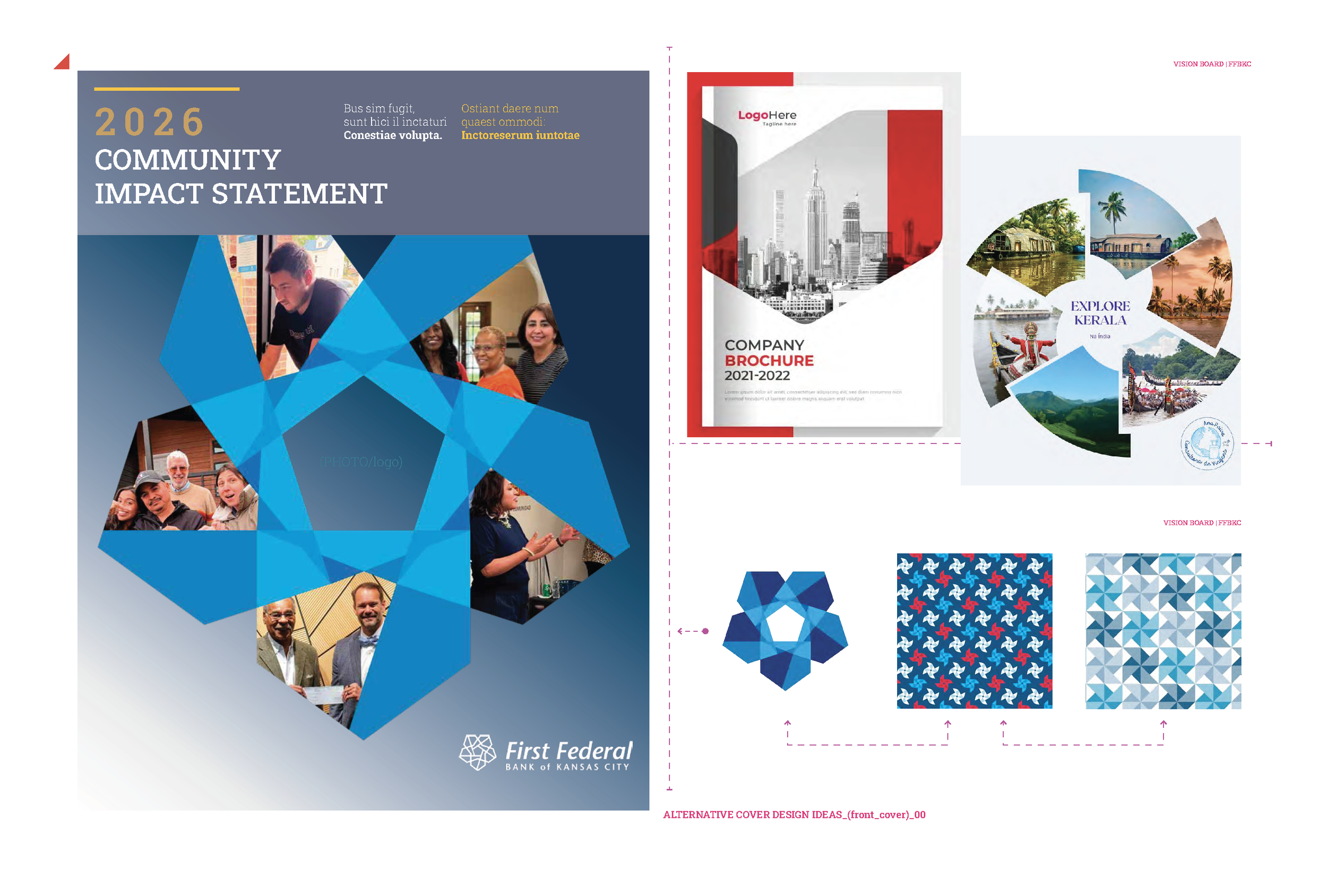
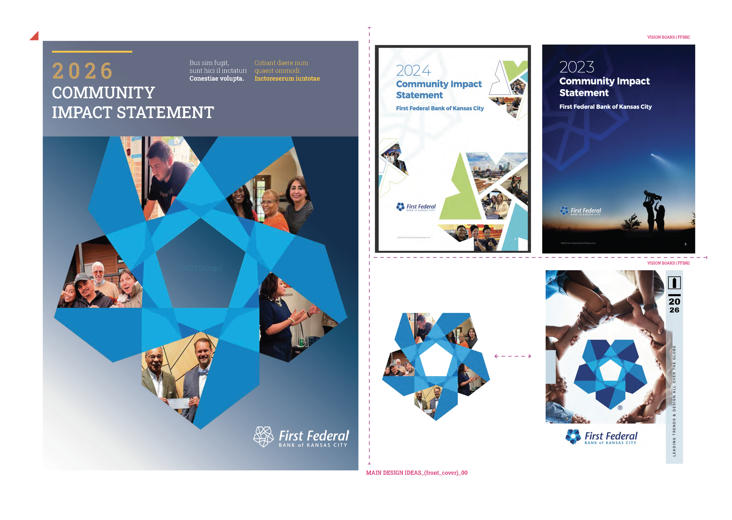
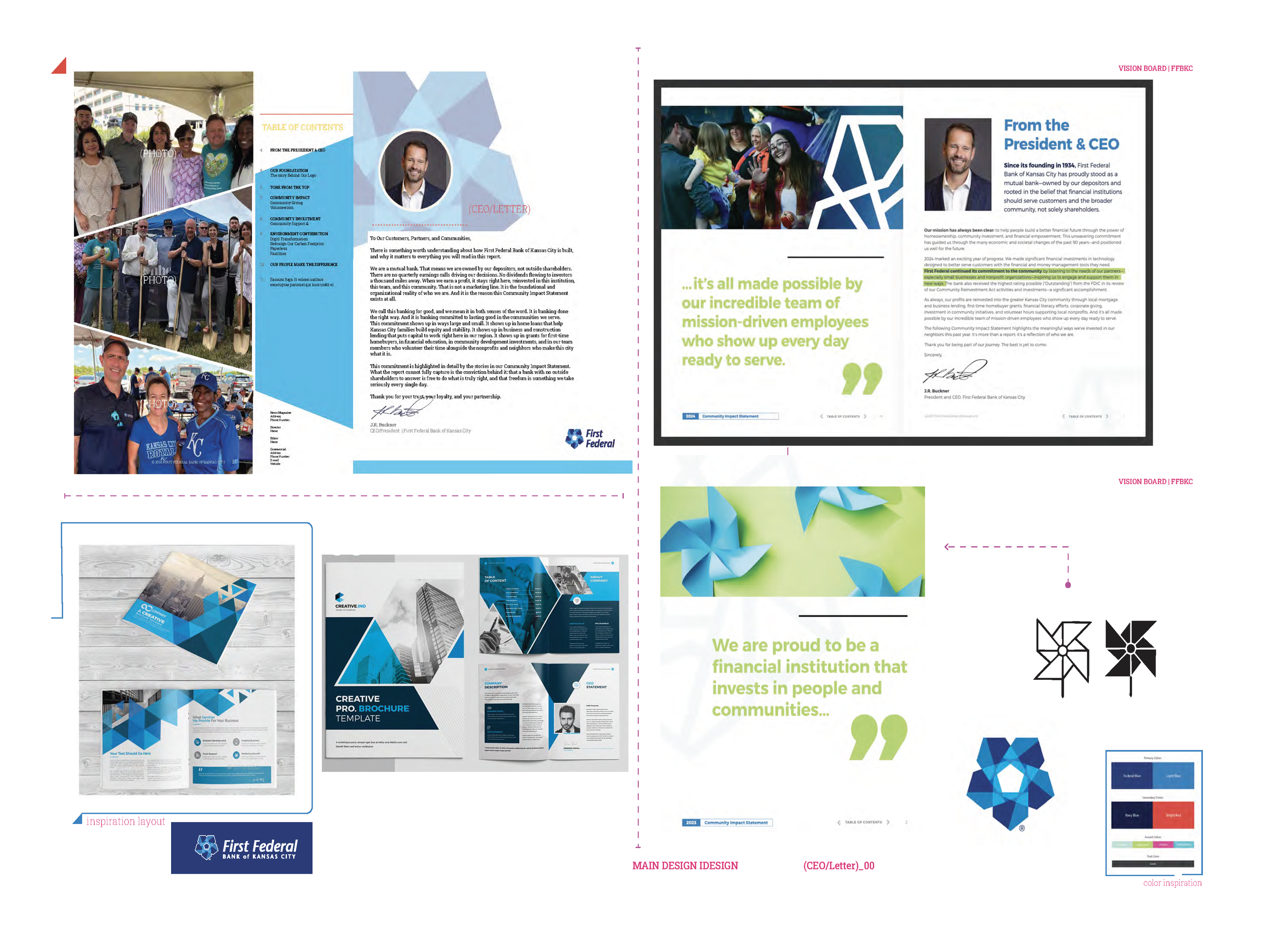
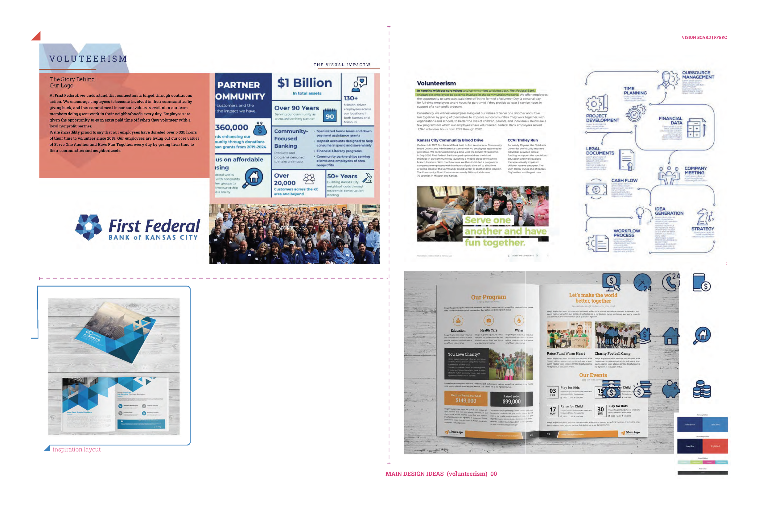
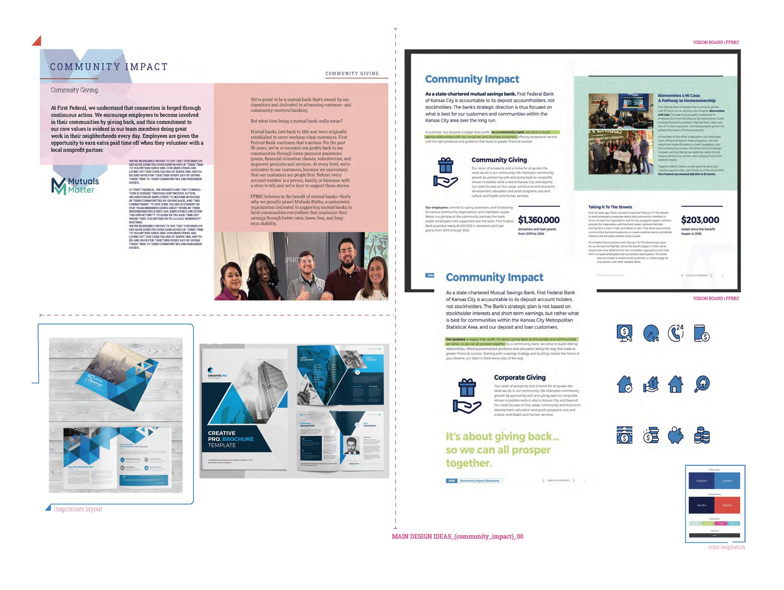
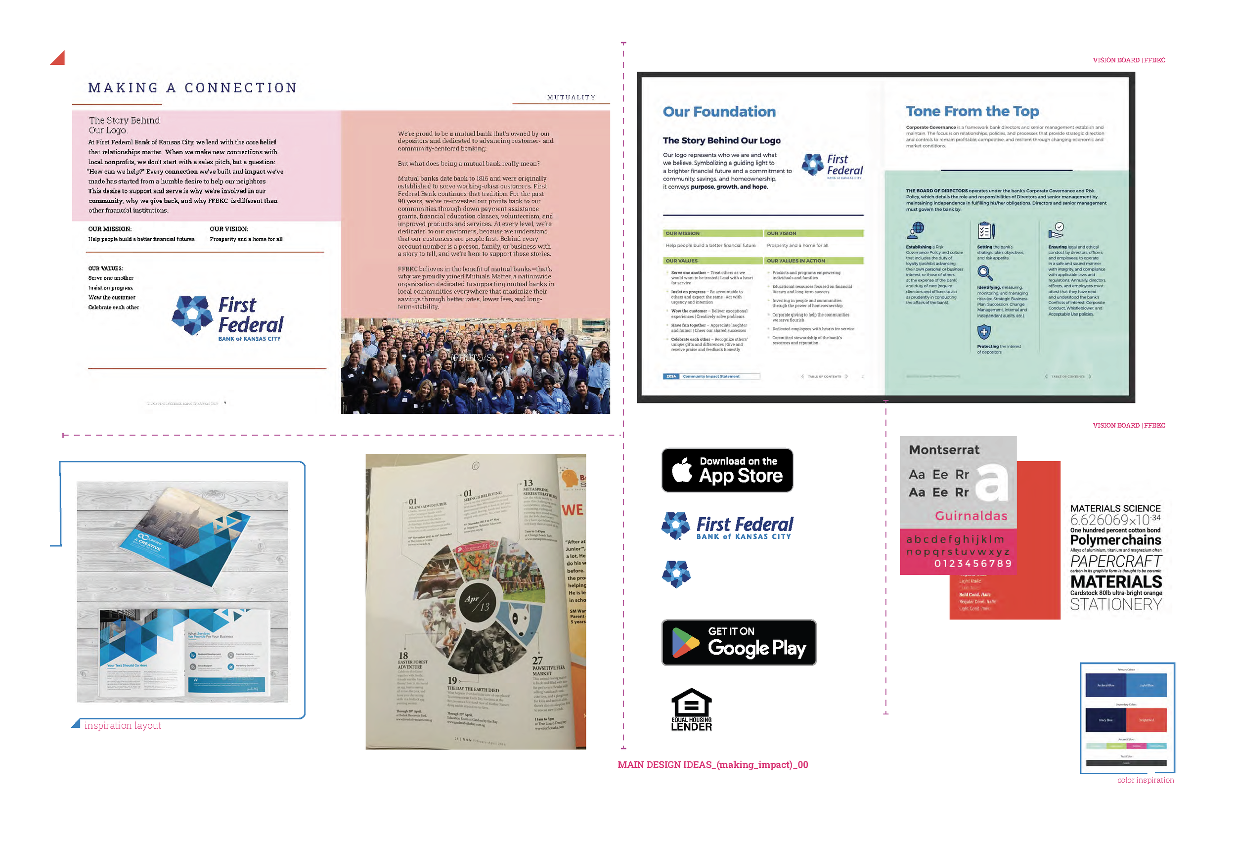
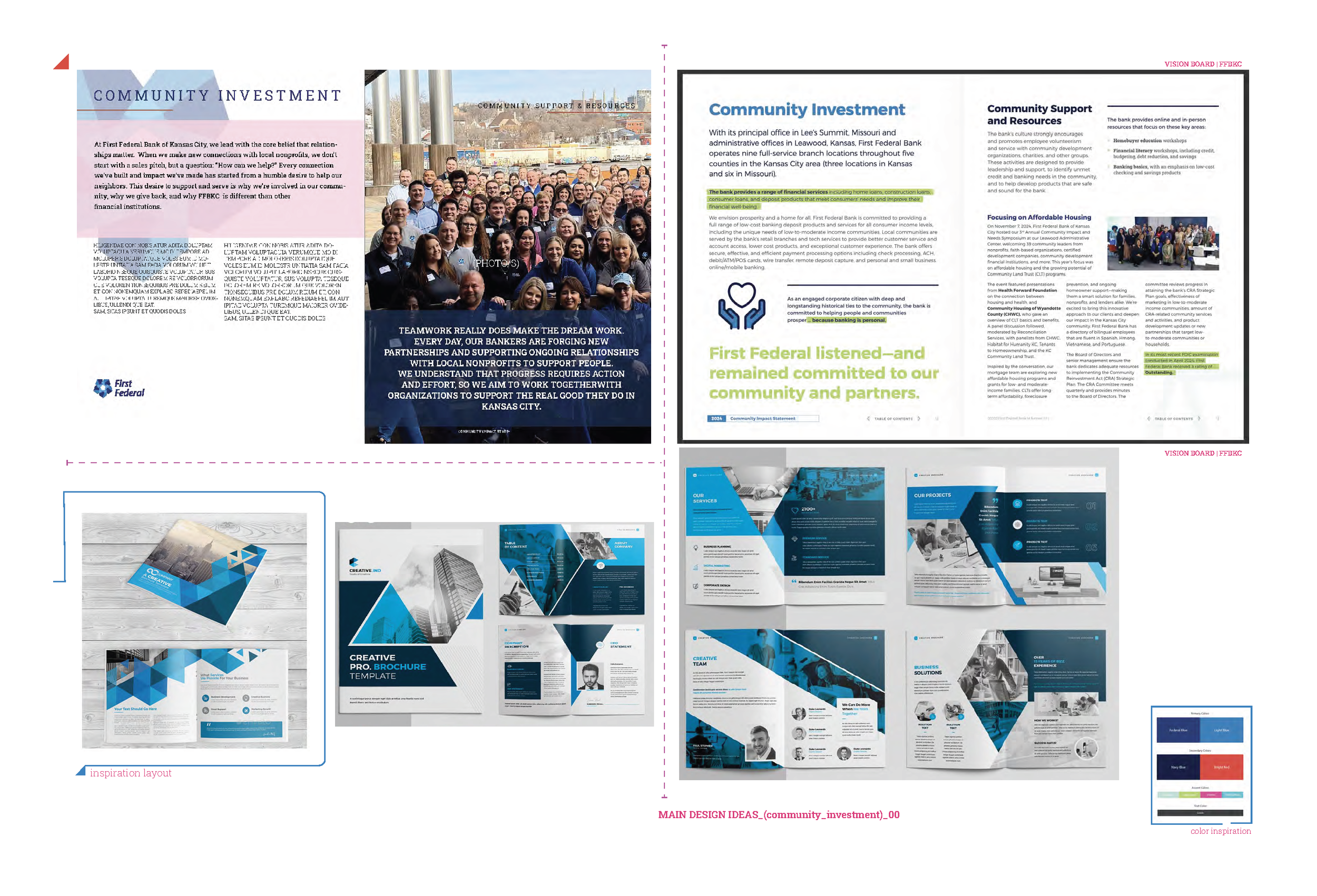
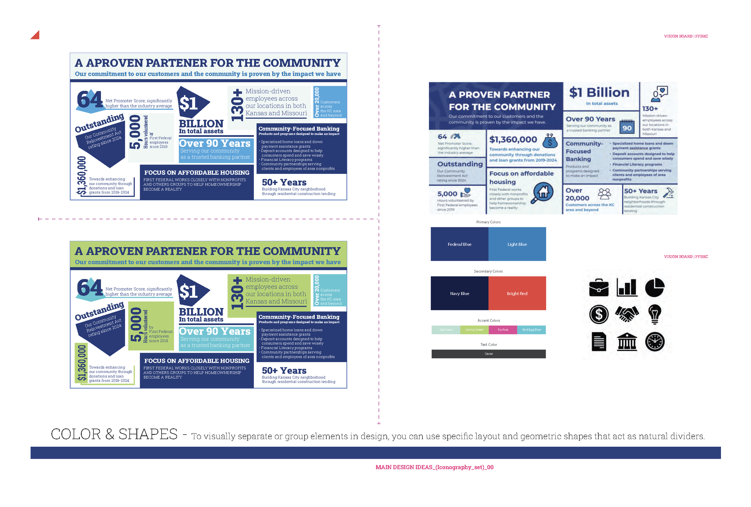
First/Federal Bank of K.C. | Kansas City, MO.
MAGAZINE/DESIGN: COMMUNITY IMPACT ZINE.
At the end of the project, the designer and clients aim to achieve a visually appealing, cohesive, and professional magazine that effectively communicates the community impact message. They seek to create a polished layout that engages readers and highlights key content, ensuring the final product aligns with the client’s branding and objectives. Delivering high-quality print and digital versions ready for distribution is also a primary goal. Ultimately, they want to produce a magazine that meets or exceeds expectations and successfully serves its purpose.
A visually cohesive and engaging magazine layout that effectively communicates the community impact message.
A polished, professional design that aligns with the client’s branding and objectives.
High-quality print and digital versions of the magazine ready for distribution.
Clear, impactful presentation of key content and visuals to engage readers.
A successful collaboration resulting in a product that meets or exceeds expectations.
Uncle/Shine
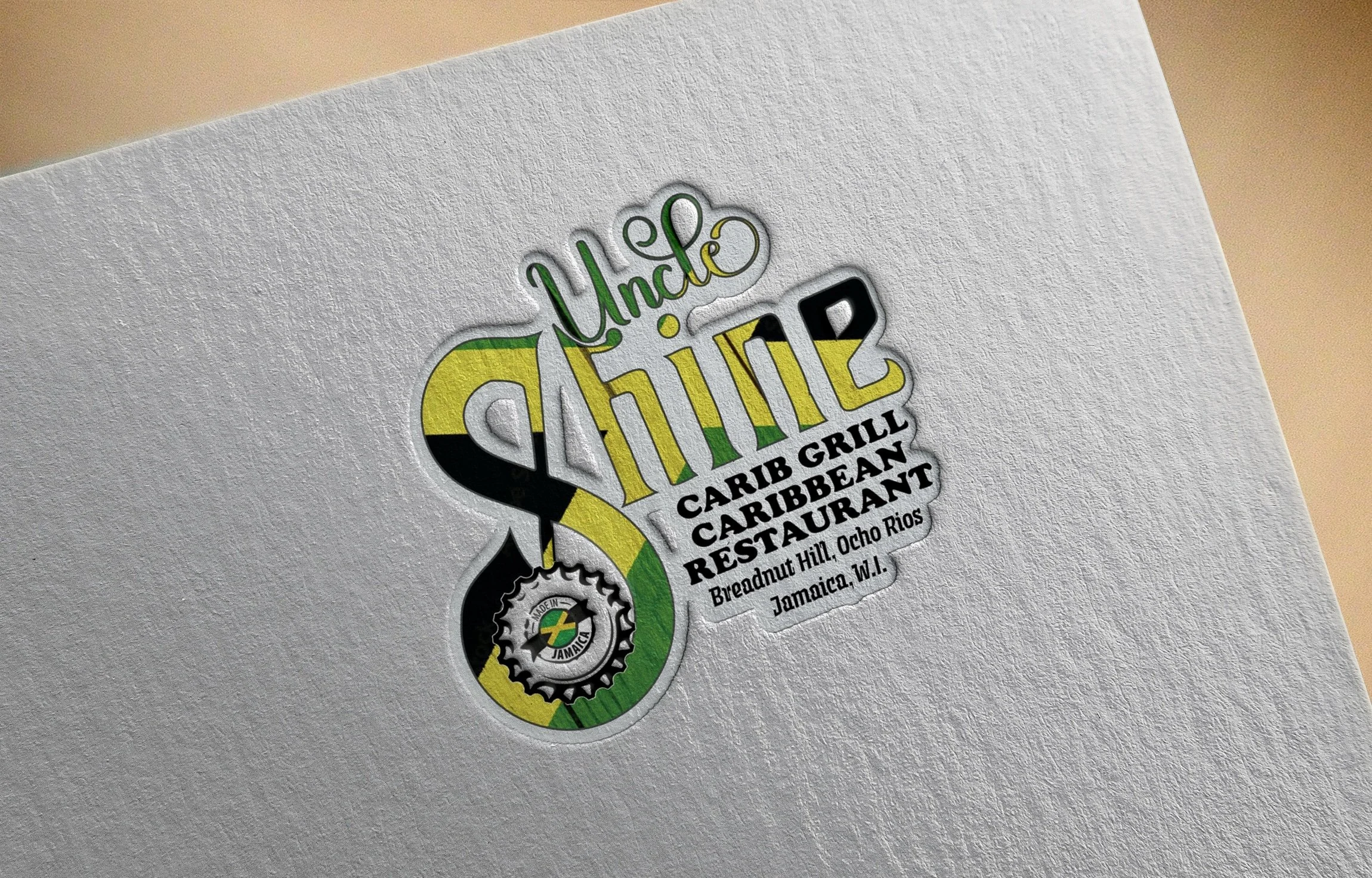
logo package | jamaica, w.I.
Uncle Shine Restaurant (Jamaica) is renowned for its authentic Jamaican flavors and welcoming, home-style hospitality. I designed their logo for my portfolio, creating a distinctive mark that features bold tropical colors, hand-drawn typography, and island motifs to capture the restaurant’s warm, vibrant cultural spirit.
Primary logo for versatile branding
Secondary logo variations for different applications
Color palette and typography guidelines
Brand usage and placement rules
Complementary graphic elements or icons
Final logo files in multiple formats
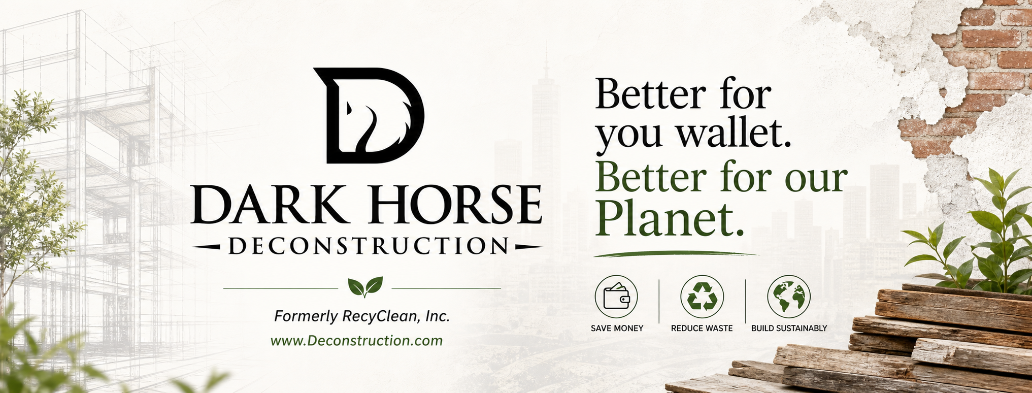
Dark/Horse Deconstruction | Milwaukee, WI.
Digital Embroidery services | Milwaukee, WI.
At StudioGraphics8, we are re-developing Dark Horse Deconstruction’s emblem marks using digital embroidery styles. Specializing in sustainable deconstruction and demolition across the Midwest, the company recovers high-value materials while minimizing environmental impact. Our textured, layered designs reflect their craftsmanship and eco-friendly ethos, adding a modern, tactile quality to their branding. This approach reinforces their commitment to sustainable practices and creates a distinctive, innovative visual identity aligned with their core values.
Adding a tactile, realistic texture to branding elements.
Enhancing visual interest and depth within the design.
Reinforcing themes of craftsmanship, sustainability, and attention to detail.
Creating a modern, innovative aesthetic that aligns with the company's eco-friendly focus.
Differentiating the brand by providing a unique, memorable visual identity.